The main purpose of SEO is to help people find what interests them in the vast online environment. In other words, SEO brings the right people to the right information.
Considering that, more than ever, the Internet is accessed from mobile devices, adapting SEO to this environment is essential.
What does this mean for you and your business? Most likely, you will need a few website adjustments so that you are relevant for searches performed on both desktop and mobile.
Why Mobile First?
Google collects information about every web page in a massive catalog known as the Index, which it then uses to formulate and display search results for various queries.
Until recently, Google primarily indexed web pages through the eyes of a desktop user, treating mobile pages as important but secondary to desktop pages.
Now, Google treats the mobile versions of each page as the primary indexing page, with desktop versions being secondary.
The migration to mobile is changing consumer behaviors
3 out of 5 searches are done on mobile, placing the mobile phone as the preferred device for conducting searches, well ahead of the desktop.
And if, until recently, searches performed from mobile devices took place on the go, outside the home, that is no longer the case: 77% of mobile searches take place at home or at the office.
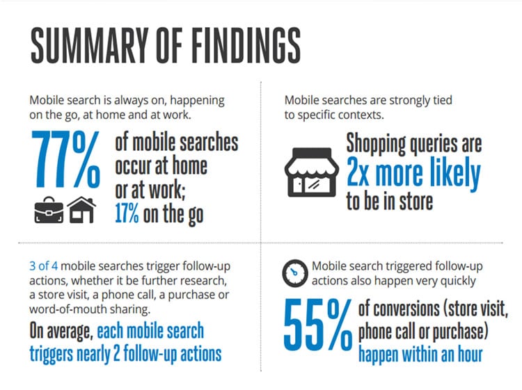
Moreover, mobile users are much more determined to buy something following an internet search. In other words, mobile searches have the power to convert.
According to this compilation of statistics, 9 out of 10 searches performed from a mobile device convert into purchases or a store visit.

Out of a desire to be as relevant as possible for users, Google decided to index pages that are adapted to mobile platforms. Algorithms will continue to consider websites and applications, but they will use the structured content of mobile versions as a benchmark.
Google will primarily consider the mobile version of your website when performing search rankings.
Therefore, if your website is optimized for mobile, it will rank well in both mobile and desktop searches.
And to have a website that is relevant in Google searches, you only need one important thing: a responsive and mobile-optimized site.
What does it mean to be relevant in the Mobile First Index?
Google considers that being mobile friendly means that users can read the text without having to zoom, scroll, or use extra buttons.
Mobile Friendly has the following characteristics:
- a responsive design (a site that changes the size of its content depending on the screen size of the device from which it is accessed);
- ease of navigation from a mobile device;
- site speed;
- non-invasive interstitials.
A website should look good, be easy to navigate, and be displayed properly on mobile. For a website to be responsive, its content should behave like water filling a vessel.

All responsive sites are mobile-friendly, but not all mobile-friendly sites are responsive.
Responsive involves resizing the content according to the device from which it was accessed.
Mobile-friendly means that the website is displayed the same on all devices.
Mobile-friendly websites are built primarily for mobile, which means that on desktop they will not reach their full potential.
Responsive websites, on the other hand, offer people access to both dimensions, and this is the reason why Google recommends implementing a responsive design.
How can you be mobile first?
Specialists in development quickly adopted this term, as well as the practice related to it, so that mobile-first is the standard today. Often, when referring to the desktop version, the web developer community calls it the non-mobile version.
A first step to understanding and successfully developing a responsive website is the course offered for free by Google itself.
In addition to the fundamentals you can learn from the course offered by Google, here are some other details you can keep in mind:
- The ease with which users use the website. The design should address “fat fingers,” meaning buttons and links can be accessed without difficulties;
- Site loading speed is vital on mobile;
- No interstitial pop-ups, which Google avoids.

Optimize content for mobile
There is a first rule in this regard, namely that mobile users must have the same experience as desktop users when visiting your site.
There is a very high chance that your website has recorded many more visits from mobile so far than from any other device.
Users search, interact, and consume information in a mobile context. In this logic, it is obvious why your site’s content should be designed in accordance with mobile users.
Structure the articles
For example, a 3000-word article can be read without problems from a desktop device, but from a mobile one, the article already becomes intimidating.
If the article is nevertheless extensive, try to use short paragraphs, interspersed with images or videos (infographics or screenshots), as the present article successfully illustrates.
Use as much diversity as possible in terms of content. Audiovisuals are very popular in the mobile environment and offer a pleasant experience to users.
Develop a Mobile First strategy
Many of those who build a website develop it for desktop first and then convert it for mobile 51% of Internet traffic. This is no longer valid, considering that it is generated using mobile devices.
Keep the mobile environment in mind first, because what looks good here will also look good on desktop.
Do you need help implementing Mobile-First for your business website?
Mobile optimization can no longer be ignored, considering the massive migration of users to mobile. Google already prioritizes search results based on how responsive the website is.
In the absence of optimization, you risk your company’s website not being considered as relevant as it deserves. If you need help in this regard, contact us and our team will respond as soon as possible!
Have you read everything? Comment / join our newsletter / read our other research posts!